

In today’s digital landscape, mobile devices are the primary way people access the internet. This means that designing websites with mobile users in mind is no longer optional; it’s essential. A mobile-first approach ensures that your website is accessible and user-friendly on all devices, from smartphones to tablets. This approach is crucial for providing a seamless experience across all platforms. A mobile-first design prioritizes the mobile experience, ensuring that the website is responsive and functional on smaller screens. This approach often involves simplifying the design, optimizing images, and streamlining navigation. By focusing on the mobile experience first, you can create a website that is both visually appealing and highly functional on all devices. The benefits of mobile-first design extend beyond accessibility. It also improves SEO, as search engines prioritize mobile-friendly websites. Furthermore, a well-designed mobile website can significantly improve user engagement and conversion rates. By prioritizing the mobile experience, you’re not just creating a website that works on mobile devices; you’re creating a website that performs well and provides a positive user experience.
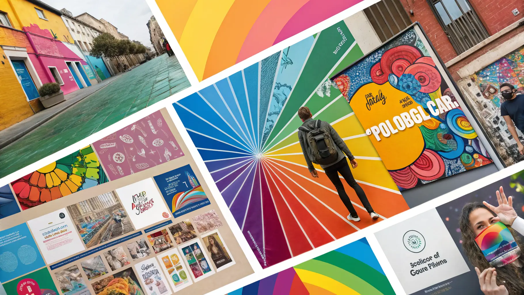
Graphic Design Trends for 2024
Explore the latest graphic design trends that are shaping the future of visual communication.